- All checklists
- Marketing
- Graphic design checklist
Graphic design checklist
The Graphic Design Checklist is a step-by-step guide for designing high-quality visuals that effectively communicate a message. It covers areas such as design briefs, research, idea evaluation, document setup, text optimization, and final output. This checklist helps designers and businesses produce professional designs while meeting deadlines and staying within budget.

- Prepare a design brief
- Conduct research
- Brainstorm
- Choose the concept
- Evaluate ideas
- Set a deadline
- Plan your budget
- Create drafts
- Choose tools and set up your workspace
- Set the document size
- Take care of the margins and bleed
- Configure the color mode
- Select fonts
- Organize the layout and composition
- Choose appropriate colors
- Optimize images
- Perform a text checkup
- Use rich black
- Include copyright information
- Adjust the contrast
- Maintain balance
- Include crop marks
- Prepare brand guidelines
- Perform a checkup
- Distribute
There are many elements to consider when designing graphics, and it’s important to do your research before you get started. Use this handy checklist to help you.
What is a graphic design checklist?
A graphic design checklist is a list of elements you should check before publishing any content. You need to think about how each aspect relates to your specific goals.
The importance of a graphic design checklist
It helps avoid making common mistakes. It also ensures that your graphics are accurate and professional-looking. Furthermore, it helps produce high-quality graphics that will make your business stand out from the competition.
Who can benefit from a graphic design checklist
- Business owners can create accurate and professional-looking graphics for their websites, brochures, and other promotional materials. They can even use it to organize their preferences and process on how to find a graphic designer.
- Graphic designers can ensure that their designs are accurate and meet their client’s requirements. They can also use it as a tool for improving the quality of their work and producing high-quality designs on time.
- Marketing teams can deliver graphics faster and more accurately, or brief graphic designers on how to do so.
Explore the graphic design checklist
Conceptual stage
A design brief is a document that provides all of the relevant information about a project. It should include:
- the objective of the design
- who the target audience is
- what the specific requirements are (e.g. file type and dimensions)
- any other relevant information
Why is a design brief important?
It provides you with all the information you need to start working on a project. If some of the critical elements are missing, this can lead to mistakes and delays later in the process.
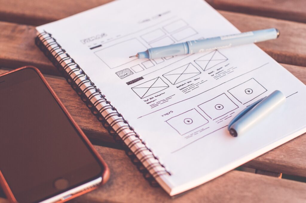
How to create a brief for design?
You can write a brief yourself, but it’s best to get your client to do so. This way, it will meet their expectations from the beginning.
Which tools to use to create a brief for design?
There is no need to use a professional vector-based design and drawing program in this step. You can simply use Google Docs or other word processor.
Research is crucial for creating high-quality visuals that accurately convey the message. Make sure to gather information on the topic you’re communicating, as well as any relevant competitor designs.
Why is research important?
It helps you learn more about your audience and what they are looking for in terms of visuals. You want to make sure that the information or concept being communicated is clear and doesn’t confuse them.
How to conduct research?
Take a look at other designs in your industry and competitors’ brands. According to the design preferences of consumers in that market, you can decide what will work and what won’t.
Which tools to use to do design research?
If you’re not sure where to start, try using Behance or Pinterest to get inspiration.
This allows you to develop innovative ideas for your design concept. The best way to tackle this stage is to ensure that there are no limits or restrictions so you can explore as many options as possible.
Why is brainstorming important?
This step will ensure that you have a wide range of concepts to choose from before moving onto the next stage.
How to brainstorm?
Have a creative environment where everyone can contribute their ideas, regardless of how outlandish they might seem. Remember, there are no bad ideas in brainstorming.

Which tools to use to brainstorm?
You will need a notebook and a pen to write down your thoughts and your ideas, no matter how simple.
When it comes to choosing a design concept, creatives often struggle, since it can be difficult to know what will produce the desired result.
Why is the concept important?
At this stage, you will narrow down all of the concepts you created during brainstorming, making the design process easier.
How to create a concept?
The design team needs to agree on a concept before moving forward. This will prevent disagreements and confusion later on.
Which tools will help you choose the concept?
A mood board can help you visualize the particular concept and get everyone on the same page.
To create the best design possible, it’s time to start evaluating your ideas.
Why is this step important?
It will help determine the specific details of your design and make sure everything is in line with your vision.
How to evaluate ideas?
You must know your goals before evaluating ideas. If team members are working collaboratively, be sure to regularly communicate any changes.
Which tools to use to evaluate ideas?
Templates can help with getting your ideas down visually and evaluating different design options.
One of the most important aspects of any project is setting and meeting deadlines. This step helps make sure that everyone involved in the project knows what they need to do and when it needs to be done.
Why is setting a deadline important?
This will help keep everyone on track and avoid delays or missed milestones.
How to set a deadline?
Create a timeline with specific deadlines for each stage of the design process. This will ensure that everything stays on track.
Which tools to use to set deadlines?
A project management tool such as Asana.
Consider your budget when designing any type of content. You will spend no more than your allotted budget while still completing all the elements in your design.
Why is planning your budget important?
To ensure you don’t go over budget and still achieve the look and feel you desire.

How to plan your budget?
Discuss in advance any needs and limitations your team might have. It will help you determine your budget for each phase.
Which tools to use to plan your budget?
A spreadsheet in Google Sheets for organizing and keeping track of your budget.
The next step is to draft designs once you have finalized your concept. This will give you a better idea of how everything should look when it’s finished.
Why is creating drafts important?
This step allows for revisions and feedback so that any necessary changes can be made before the design is finalized.
How to create drafts?
Team members can reach out if they have any concerns or questions during this time. It can also contribute to preventing any last-minute changes that may affect deadlines.
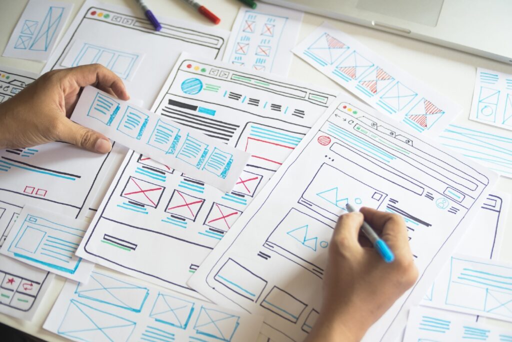
Which tools to use to create drafts?
Adobe Photoshop or Illustrator, although these are relatively complex tools. For those without technical skills, Canva is a much easier alternative.
Project setup
Before you even begin to make a graphic design, look at the project setup. This means choosing the right tools and setting up your workspace in an efficient way.
Why is this step important?
If you’re using the wrong tools or your workspace isn’t set up correctly, it might slow down your workflow and cause frustration.
How to choose tools and set up your workspace?
For example, if you’re working on a web design, make sure you have all of the necessary software downloaded and installed ahead of time.
Which tools to use in this step?
You need a good design program (Adobe Photoshop, Adobe Illustrator, InDesign, etc.), plus a drawing tablet for graphic designers.
To begin with, make sure your document size is set correctly.
Why is setting the document size important?
Using the wrong document size can distort your graphics and have a negative effect on the overall look of your design.
How to set the document size?
Be sure to check the dimensions needed for the project. Your design needs to fit its purposes.
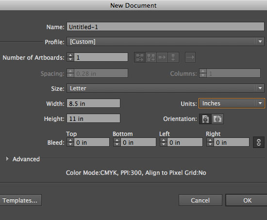
Which tools to use to set the document size?
All design programs allow you to change the document size from the document settings.
The margin is the space between the main content and the edges. The bleed is the area that extends beyond the “finished” cut edge.
Why is this step important?
If these aren’t set up correctly, your graphics may be cropped or end up looking distorted.
How to take care of margins and bleeds?
In most cases, you’ll be working with a margin of 0.25″ and a bleed of 0.125″ by default.
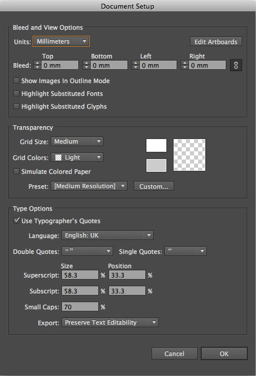
Which tools to use in this step?
Most design programs have default margin and bleed settings that you can change if necessary.
The color mode can determine how colors combine according to the number of channels in a color model. This can affect color detail and file size.
Why is this step important?
If you choose the wrong color mode, your graphics may appear distorted or washed out after printing or distributing. They could also look completely different from the colors you see in your design project.
How to configure the color mode?
If you’re working on a design for a website or social media, etc., make sure the color mode is set to RGB. This will ensure that your logo looks accurate when displayed on a computer screen.
If you need to print your design, you’ll need to change the color mode to CMYK.
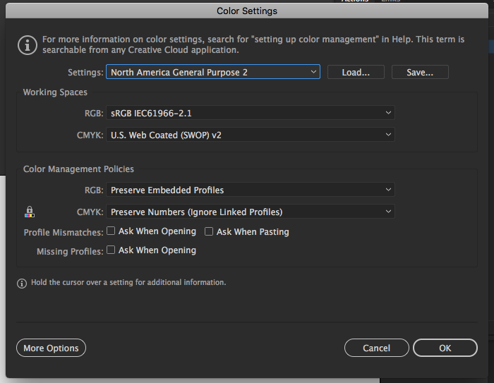
Which tools to use to configure the color mode?
Adobe Photoshop and Illustrator both have a variety of color modes that you can choose from, such as index mode (256 colors), grayscale mode (256 grays), and Bitmap mode (2 colors).
In Adobe Photoshop and Illustrator, you can access these options in the new document window. If you have already created a project, go to File > Document color mode.
Design elements
Make sure fonts are easy to read. You don’t want your text to be challenging to scan through.
Why is selecting fonts important?
Hard-to-read fonts can make your content difficult to understand.
How to select fonts?
First, stick with just a couple of different fonts and use them consistently throughout your design.
Second, avoid busy-looking fonts like cursive or handwriting styles unless they fit your brand identity.
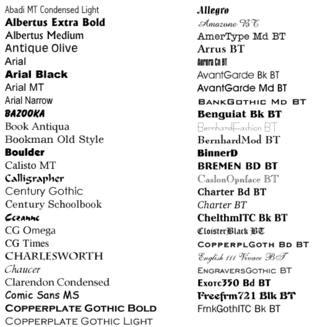
Which tools to use to select fonts?
If you’re unsure which fonts to use, some websites allow you to test out different fonts together before committing, e.g. Flippingfonts.com.
In graphic design, the layout refers to the arrangement of visual elements on a page that make up the content of the design.
Why is this step important?
The layout has two objectives: to convey the message correctly and to present information in a logical, coherent way that highlights the most critical points. If the layout isn’t correct, it can make your graphics look unprofessional and/or disorganized.
How to organize the layout and composition?
Here are five points to keep in mind for preparing a good layout:
- proximity – group together related items
- white space – leave gaps between the content, lines, and outer margins
- alignment – be consistent, arrange the content inside of a grid
- contrast – draw attention to something significant
- repetition – repeat or echo certain elements of your design to reinforce the message
Which tools to use to organize the layout and composition?
It is possible to create and save your guide layouts as presets in Adobe with the Guide Layout feature.
It’s time to select your color palette for the project.
Why is choosing appropriate colors important?
A website or graphic can look completely different if the incorrect color is used.
For example, a bright red background may not be appropriate for a webpage’s content. Even using white text won’t help since users will not read it.
How to choose appropriate colors?
In general, you should use colors that work well together and have a purpose within the design. If you don’t know how, follow the color theory.
Which tools to use to choose appropriate colors?
In Adobe, you can create a custom color palette. You can also find different color combinations online or in design textbooks if you’re stuck.
If you include any images in the project, you should optimize them first.
Why is optimizing images important?
Images that aren’t optimized will make the size of your final design too large, or it might appear pixelated.
How to optimize images?
There are many different ways to optimize an image. You can reduce the size of the file by compressing it, or you can use an image format such as JPEG or PNG that will automatically optimize it.

Which tools to use to optimize images?
In Adobe Photoshop, the Save for Web option allows you to optimize images before exporting them into different formats. You can also find online tools that will optimize your images for free.
If your design contains any text, ask yourself the following questions:
- Are all the used fonts licensed for commercial use?
- Is the text easy to read, or is it cramped and hard to make out?
- Have any words been duplicated or used too many times throughout the design?
- Is there enough contrast between the text and its background/surrounding elements?
- Is the text properly aligned and formatted?
Why is performing a text checkup important?
If you’re not careful, using wrong fonts or text alignment can make your design look unprofessional.
How to perform a text checkup?
To choose the correct font scheme, it’s crucial to have a general idea of what you want your document to look like. For example, if you’re creating a flyer for an event, use fonts that are easy to read and match the event’s tone.
Which tools to use to perform a text checkup?
In Adobe Photoshop, you can use the Text tool to create and edit text. In Adobe Illustrator, a separate Type tool allows you to format and align your text. You can also find more options for editing text within both programs under the Window menu.
If you’re using a black background in your design, it’s important to use rich black instead of standard black. Especially if you plan on printing your design.
Why is using rich black important?
Rich black is deeper than standard black, making the text and other elements look sharper and cleaner.
How to use rich black?
You have to change the CMYK ink values. It might take a few tries to find your perfect rich black formula.
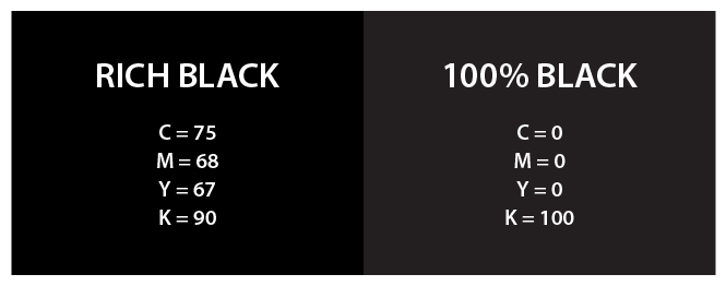
Which tools help you use rich black?
In Adobe Illustrator, there is a swatch called Graphic Black that you can use to create rich black.
Copyright law protects creative work from unauthorized reproduction and usage. If you’re using any images or fonts that aren’t your own, be sure to include the owner’s copyright information in the document.
Why is including copyright information important?
Using images or fonts without permission is illegal, so you must give credit to their creators.
How to include copyright information?
You must obtain permission before you use any piece of work that is protected by copyright. To avoid violating any copyright license, read and understand it thoroughly.

Which tools to use to include copyright information?
You can add copyright information to any document in Illustrator, Photoshop, or InDesign by choosing File > File Info.
The contrast is a great way to emphasize what’s essential and draw visitors’ eyes to a particular area of the project.
Why is adjusting contrast important?
Having too little contrast in your design will make reading the text and recognizing other elements difficult.
How to adjust contrast?
Contrast isn’t just limited to colors. You can add contrast to your designs by using different sizes of elements, textures, and patterns.
Which tools to use to adjust contrast?
You can use a free online tool like the Contrast Checker to determine the differences between various elements.
If you’re using any images or illustrations that contain text, make sure the elements are balanced.
Why is maintaining balance important?
Graphic elements should be balanced out when you design so they appear intentional rather than accidental.
How to maintain balance?
Balance can be achieved using different visual weights such as Symmetrical, Asymmetrical, Radial, or even Off-Balance.

Which tools to use to maintain balance?
In Adobe, there are a few ways to achieve balance in your design. One way is to use the Rule of Thirds grid. You can also adjust the position and size of elements until they look balanced.
Output
If you plan to print your design, it’s important to include crop marks.
Why is including crop marks important?
Crop marks help the printer recognize where to cut the paper so that everything displays correctly.
How to include crop marks?
If you plan to have your document commercially printed, produce a sample page first to ensure the crop marks are accurate.
Which tools to use in this step?
In Adobe, you can add custom crop marks by adjusting the settings under Crop Marks.
The final step of creating a design is to prepare brand guidelines so that everyone knows how exactly they can use the graphic design.
Why is preparing brand guidelines important?
Make sure the brand guidelines specify how and when your design can be used, especially if you’re designing a logo or a marketing image. Not establishing clear rules could lead to problems in the future.
How to prepare brand guidelines?
The brand guidelines should include information about acceptable file formats, colors, and sizing for the following elements:
- logo
- images
- fonts
Which tools to use to prepare brand guidelines?
You can choose any of the following programs: Adobe Illustrator, Microsoft Word, or Google Slides.
Check your design one more time before publishing it or sending it to the printer or client.
Why is performing a checkup important?
To avoid any errors in the final product, you should double-check everything.
How to perform a checkup?
Verify that you have not overlooked anything important by going over all steps of the graphic design checklist again.
Which tools to use to perform a checkup?
Using our checklist is probably the easiest way to achieve this. Find out for yourself!
When your design is finished, it’s time to distribute the final product.
Why is distributing important?
Make sure you are saving your project in the right format. Otherwise, it can decrease the quality of your work.
How to distribute?
Exporting one project in several formats is the best way to do this.
Which tools to use to distribute?
Standard raster files are JPEG, PNG, and GIF. In addition, you could save your design in PDF or export it to AI, EPS, TIFF, and PSD for further editing.
Summary of graphic design checklist
Conceptual stage:
- Prepare a design brief
- Conduct research
- Brainstorm
- Choose the concept
- Evaluate ideas
- Set a deadline
- Plan your budget
- Create drafts
Project setup:
- Choose tools and set up your workspace
- Set the document size
- Take care of the margins and bleed
- Configure the color mode
Design elements:
- Select fonts
- Organize the layout and composition
- Choose appropriate colors
- Optimize images
- Make text checkup
- Use rich black
- Include copyright information
- Adjust the contrast
- Maintain balance
Output:
- Include crop marks
- Prepare brand guidelines
- Perform a checkup
- Distribute
Frequently Asked Questions
How much do graphic designers charge?
Rates can vary greatly depending on a designer’s experience and the type of project. However, in general, graphic designers charge anywhere from $25 to $200 per hour, with the average rate being around $75 per hour. Some designers may also charge a flat fee for a project type rather than charging by the hour. This fee could be anywhere from $500 to $5,000 for a project that typically takes 50-100 hours to complete.
What are some common graphic design mistakes?
Choosing too many fonts, including low-resolution images, using text that’s too small or difficult to read, and not adding enough white space. It’s best to stick to two or three fonts at the most and make sure they complement each other. Low-resolution images often look blurry and pixelated when enlarged, so it’s wise to use high-resolution images whenever possible. White space is critical for creating a visually appealing layout and making text easy to read.
Why should I hire professional graphic designers?
Professional graphic designers will produce high-quality graphics that adhere to your company’s aesthetic aspect, stand out on social media, persuade new customers, and foster loyalty. The designs won’t require time-consuming and expensive design updates down the road, but rather look fresh for years to come.
What should a graphic design checklist include?
It should include specific design requirements, principles to be followed, and a review process. Complete the checklist and you’ll see that we cover all these aspects.
You will be
in Good Hands!
Join our community of happy clients and provide excellent customer support with LiveAgent.

Our website uses cookies. By continuing we assume your permission to deploy cookies as detailed in our privacy and cookies policy.
- How to achieve your business goals with LiveAgent
- Tour of the LiveAgent so you can get an idea of how it works
- Answers to any questions you may have about LiveAgent

 Български
  Čeština
  Dansk
Dansk  Deutsch
  Eesti
Eesti  Español
  Français
  Ελληνικα
  Hrvatski
  Italiano
  Latviešu
  Lietuviškai
  Magyar
  Nederlands
  Norsk bokmål
  Polski
  Română
  Русский
  Slovenčina
  Slovenščina
  简体中文
简体中文  Tagalog
  Tiếng Việt
  العربية
  Português

